
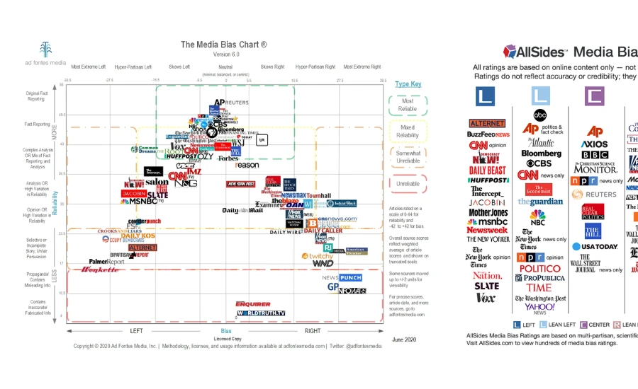
The Media Bias Chart is one of the most shared infographics in American media discourse. It maps news sources onto a two-dimensional grid — left to right for political lean, top to bottom for reliability — and gets forwarded millions of times whenever people argue about whether a news outlet is trustworthy. It is real, it is documented, it has a genuine methodology behind it, and it is also subject to legitimate criticism that most people who share it have never read. Understanding both sides of that is more useful than either reflexively trusting the chart or dismissing it.
| Detail | Info |
|---|---|
| Full Name | Media Bias Chart |
| Created By | Vanessa Otero, a Colorado patent attorney |
| First Published | December 2016 — went viral on Imgur |
| Publisher | Ad Fontes Media, Inc. |
| Founder / CEO | Vanessa Otero |
| Founded | 2018 (as a company, following the chart’s viral spread) |
| Current Version | Version 13.0 (January 2025), with August 2025 update |
| Analyst Team | Over 40 trained analysts |
| Sources Rated (as of September 2025) | 83,700+ individual articles/episodes from 2,710 web/print sources, 830 podcasts, 800+ TV/video programs |
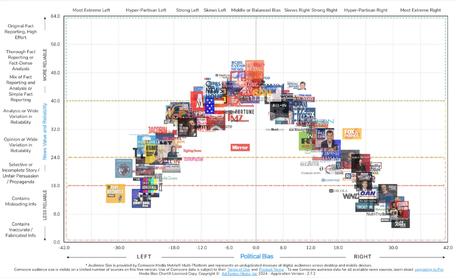
| Horizontal Axis | Political bias — left (−42) to right (+42) |
| Vertical Axis | Reliability — 0 (lowest) to 64 (original fact reporting) |
| Rating Methodology | Multi-analyst content analysis using CART software |
| Key Metrics | Expression, Veracity, Headline/Graphic (reliability); Political Position, Language, Comparison (bias) |
| Update Frequency | Flagship chart twice per year; interactive version updated daily |
| FTC Investigation | Issued June 2025 — civil investigative demand for methodology, finances, industry relationships |
| Competitors | AllSides (founded 2012), Ground News (founded 2018) |
| Business Model | Subscriptions, licensing, business data products |
| Where To Find It | adfontesmedia.com, interactive app at app.adfontesmedia.com |
Origin: A Viral Image That Became a Company
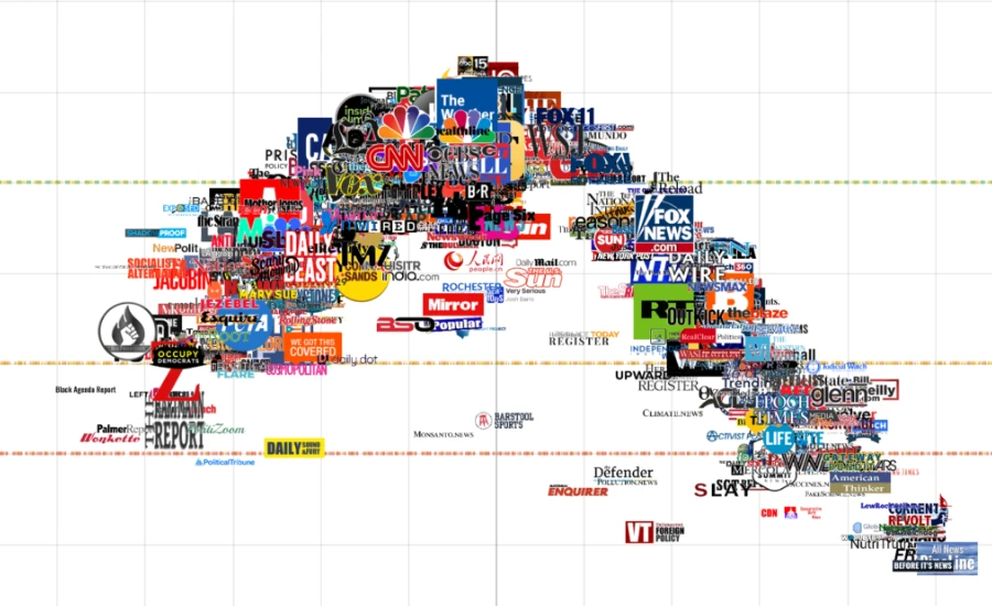
Vanessa Otero was not a journalist or a media researcher when she created the first version of the Media Bias Chart. She was a patent attorney in Colorado who was frustrated watching people in her social circles consume and share news from wildly different sources without any shared framework for evaluating those sources.
In December 2016, she posted a hand-drawn version of the chart to Imgur. It went viral almost immediately. The timing was not accidental — the 2016 US presidential election had brought renewed urgency to questions about media bias, misinformation, and the reliability of different information sources. The chart filled a felt need. People shared it extensively, debated it extensively, and criticized it extensively. All of that activity generated enough attention for Otero to found Ad Fontes Media as a formal organization in 2018, raise $4.2 million in funding by 2023, build a team of analysts, and develop the systematic methodology that underlies the current version.
The name “Ad Fontes” is Latin — it means “to the sources.” It reflects the organization’s stated purpose: helping people evaluate where their information actually comes from rather than consuming it uncritically.
How the Chart Actually Works
This is where most casual discussion of the Media Bias Chart goes wrong — people share the image without knowing how the ratings are generated.
Every source rating on the chart is a composite of ratings of individual articles or episodes, not a holistic judgment made about the outlet as a whole. Analysts evaluate specific pieces of content, not general impressions of a network’s reputation or political leanings.
Each piece of content is rated by a panel of three analysts — one who identifies politically as left, one as center, and one as right. This is an explicit attempt to mitigate individual political bias by requiring agreement across the political spectrum. The analysts use a software platform called CART — Content Analysis Rating System — and rate articles on specific defined factors.
For reliability, the three main factors are Expression (how much of the content is factual vs opinion or advocacy), Veracity (accuracy of factual claims), and Headline/Graphic (whether the headline and visuals match the actual content). A misleading headline on an otherwise accurate article counts against the reliability score.
For bias, the three main factors are Political Position (the political lean of the framing and conclusions), Language (whether loaded or neutral language is used), and Comparison (whether opposing viewpoints are represented fairly).
Analysts go through 30 hours of initial training before rating anything, plus at least 40 additional hours of ongoing training annually. Overall source ratings are composite weighted averages of individual article and episode scores. The flagship static chart is published twice yearly. The interactive version updates daily with new articles being rated continuously.
Since 2025, Ad Fontes has integrated AI-assisted rating alongside human analysts for faster processing of new content — the human-plus-AI system is sold as a commercial data product to business clients, while human-only ratings underpin the public chart.
Where Sources Tend to Land
Without reproducing the chart’s specific numerical scores, the general pattern of where major outlets tend to land is consistently reported across independent sources.
Sources that consistently score near the top center — high reliability, minimal political lean — include the Associated Press, Reuters, and BBC News. These are the reference points the chart is essentially built around.
Sources like the New York Times, Washington Post, and NPR tend to land in the upper-left — solid reliability, leaning left. The Wall Street Journal’s news section tends toward upper-center or upper-right. Fox News typically lands in the right-center to right range on bias, with reliability scores that vary depending on whether the content in question is news programming or opinion/commentary. MSNBC tends to land in the left to far-left range on bias.
At the extremes, sources like InfoWars land at the far bottom-right — extreme bias, very low reliability. When InfoWars founder Alex Jones saw this rating in 2018, he accused Ad Fontes of representing “dying dinosaur media’s extreme liberal bias.” InfoWars then published its own counter-chart placing themselves as “independent” and representing “freedom,” while labeling the Associated Press as “tyranny” — a response that was widely criticized by journalists as self-evidently absurd.
What the Chart Gets Right
Several things about the Media Bias Chart’s approach are genuinely sound and worth acknowledging directly.
The two-axis design captures something that one-dimensional bias ratings miss. Bias and reliability are genuinely different properties. A source can be highly reliable and still have a political lean. A source can be unbiased in its framing and still publish inaccurate content. Separating the two dimensions gives a more useful picture than a simple left-center-right categorization.
The multi-analyst panel design is a real methodological improvement over single-analyst assessment. Requiring three analysts from different political backgrounds to evaluate the same content, and looking for areas of agreement across the political spectrum, is a principled attempt to reduce partisan distortion in the ratings.
Rating specific articles rather than making holistic assessments about outlet reputation is methodologically preferable. News organizations publish a wide range of content — some of it reported, some analyzed, some opinion. An article-level rating system captures that variation rather than flattening an entire outlet into a single label.
The scale and volume of ratings — over 83,000 individual articles and episodes as of September 2025, across thousands of sources — gives the chart more empirical weight than informal impressions or purely qualitative judgments.
What the Chart Gets Wrong — Or At Least What Critics Say
Legitimate criticisms of the Media Bias Chart deserve as much space as its genuine strengths.
The political center is not the same as accuracy. One of the most persistent criticisms — raised by media researchers including Allison Pugh and others — is that the chart implicitly equates centrism with reliability. A source that presents “both sides” of an issue is not necessarily more accurate than one that presents documented evidence about where the truth lies on a specific question. On some questions — climate science, vaccine safety — the evidence clearly points in one direction. A source that accurately reports the scientific consensus is not biased for failing to present “the other side” as equally valid. Treating balance and accuracy as correlated can inadvertently favor false balance over truth.
The analysts’ center is not the public’s center. Ad Fontes recruits analysts who identify politically as left, center, and right. But “center” is a self-identification, and what counts as the political center shifts over time and across demographic groups. Critics argue the chart reflects a particular Beltway or professional-media definition of centrism that may not match how ordinary Americans across different regions and communities experience the political spectrum.
Subjectivity in training does not disappear through training. While the 30-plus-hour training regimen is a real safeguard, trained analysts still bring interpretive frameworks to content. What counts as “loaded language” versus precise description? What counts as “fair comparison” versus false equivalence? These are not purely objective determinations even with a defined rubric. Independent academic reviewers have noted that inter-rater reliability — whether analysts consistently produce the same scores on the same content — is a legitimate ongoing concern for any content-analysis methodology.
The snapshot problem. News outlets are not static. A source’s reliability and political lean can shift over months or years as ownership changes, editorial leadership turns over, or format shifts from news toward commentary. A rating from one year’s analysis of a specific set of articles may not reflect what the same outlet produces the following year. The chart updates continuously, but the version most widely shared on social media is typically the static biannual image, which can be significantly out of date by the time it reaches a given reader.
The FTC investigation. In June 2025, the US Federal Trade Commission issued civil investigative demand letters to Ad Fontes Media and several other media rating firms, requesting detailed information about their operations, finances, methodology, and industry relationships. The investigation is ongoing. Its implications are not yet clear. But the underlying point is legitimate: organizations that rate other organizations for bias and reliability should themselves be transparent and accountable to independent scrutiny. Who watches the watchmen is not a rhetorical question when the watchman’s ratings shape how millions of people consume information.
Competitors and Alternatives
Ad Fontes is not the only organization rating media bias, and comparing approaches is useful.
AllSides has been operating since 2012, predating Ad Fontes by four years. It rates written online content only — no TV, no podcasts, no radio. Its scale is simpler: a five-point rating of Left, Lean Left, Center, Lean Right, Right. It uses a combination of editorial review, blind surveys, community feedback, and third-party research. The simpler scale is more accessible but captures less granularity.
Ground News is a Canadian platform co-founded in 2018 by former NASA engineer Harleen Kaur and app developer Sukh Singh. It aggregates news stories from multiple sources and shows users how the same story is covered across the political spectrum, with a bias indicator derived from its source ratings. It is subscriber-funded with no media company, big tech, or government affiliation.
Each tool has different strengths. Ad Fontes offers the most granular, article-level methodology across the widest range of media types. AllSides offers the simplest, most accessible presentation. Ground News offers the most direct side-by-side comparison of how different outlets cover the same story.
Using more than one of these tools together is more reliable than treating any single one as the definitive authority.
How to Use the Chart Responsibly
The Media Bias Chart is a starting point, not a final verdict.
It is most useful for identifying sources at the extremes — outlets with very low reliability scores and very high political lean on either end of the spectrum are identifiable across multiple rating systems and most independent reviews. The chart’s most controversial ratings tend to be for sources in the middle range, where small differences in score carry less practical significance.
Do not use the chart to decide whether to trust individual articles. A single piece of journalism from a source with an imperfect rating can be excellent, well-sourced, and accurate. A single piece from a highly-rated source can be careless or misleading. Evaluate articles on their own evidence — claims, sources, transparency about methods.
Check the version and date. The static image shared on social media may be significantly outdated. Use the interactive chart at adfontesmedia.com for current ratings.
Cross-reference. If the Media Bias Chart rates a source one way and AllSides rates it differently, that discrepancy is worth noticing rather than resolving by choosing one over the other.
Be aware of motivated reasoning. People of all political orientations tend to find ratings of their preferred sources unfair. That response is worth examining in yourself before deciding the chart is wrong.
You may also like ACFT Score Chart
FAQ
1. What is the Media Bias Chart?
A two-dimensional chart that maps news sources by political bias (horizontal axis, left to right) and reliability (vertical axis, low to high). Created by attorney Vanessa Otero, first published in 2016, now maintained by Ad Fontes Media.
2. Who makes the Media Bias Chart?
Ad Fontes Media, Inc., founded by Vanessa Otero in 2018. The rating team includes over 40 trained analysts who evaluate individual articles and episodes using a defined content analysis methodology.
3. How does Ad Fontes rate news sources?
Each article or episode is rated by a three-person panel — one left-leaning, one center, one right-leaning analyst — using defined criteria for reliability (Expression, Veracity, Headline/Graphic) and bias (Political Position, Language, Comparison). Source ratings are composite averages of article and episode scores.
4. Is the Media Bias Chart itself biased?
Critics argue it reflects a particular definition of political centrism that equates balance with accuracy, which can penalize sources that accurately reflect scientific or factual consensus without presenting “both sides.” Ad Fontes disputes this characterization. The debate is substantive and ongoing.
5. Who is Vanessa Otero?
A Colorado patent attorney who created the first Media Bias Chart in December 2016 and founded Ad Fontes Media in 2018 as a formal organization to publish and update it.
6. Is the Media Bias Chart free?
The static chart image is free to download for educational and non-commercial use. Commercial licensing applies for business use. An interactive version and mobile app are available at adfontesmedia.com.
7. What does the FTC investigation mean for Ad Fontes Media?
In June 2025, the FTC sent civil investigative demand letters to Ad Fontes and other media rating firms requesting details about operations, finances, methodology, and industry relationships. The investigation is ongoing. Its outcome and implications are not yet determined.
8. What is AllSides and how does it differ from Ad Fontes?
AllSides rates written online content on a five-point scale from Left to Right, without measuring reliability and without covering TV, podcasts, or radio. It uses editorial review, blind surveys, and community feedback. Its approach is simpler and less granular than Ad Fontes’s article-level content analysis.
9. How often is the chart updated?
The flagship static chart is published twice yearly. The interactive online version updates more regularly as analysts continuously rate new articles and episodes.
10. Where does a specific outlet tend to land on the chart?
AP, Reuters, and BBC News tend to score near the top center. New York Times, Washington Post, and NPR tend toward upper-left. Fox News tends toward right on bias, with variable reliability depending on content type. MSNBC tends toward left to far-left on bias. InfoWars scores at the far bottom-right. Individual ratings are available on the interactive chart at adfontesmedia.com.
11. Can I trust the chart’s ratings for specific articles?
No single rating system should determine trust in individual articles. Use the chart as a general guide to source patterns, then evaluate specific articles based on their own claims, sources, and transparency.
12. Are there other media bias rating tools I should know about?
AllSides (2012), Ground News (2018), and PolitiFact are the most widely used alternatives. Using multiple tools and comparing their ratings gives a more reliable picture than relying on any one system exclusively.